
I use a human-centered, problem-solving design process to create high-quality products and services that deliver a frictionless user experience while satisfying the needs and expectations of businesses and customers.
Replatformed Application
Created Design System
Redesigned Online Experience
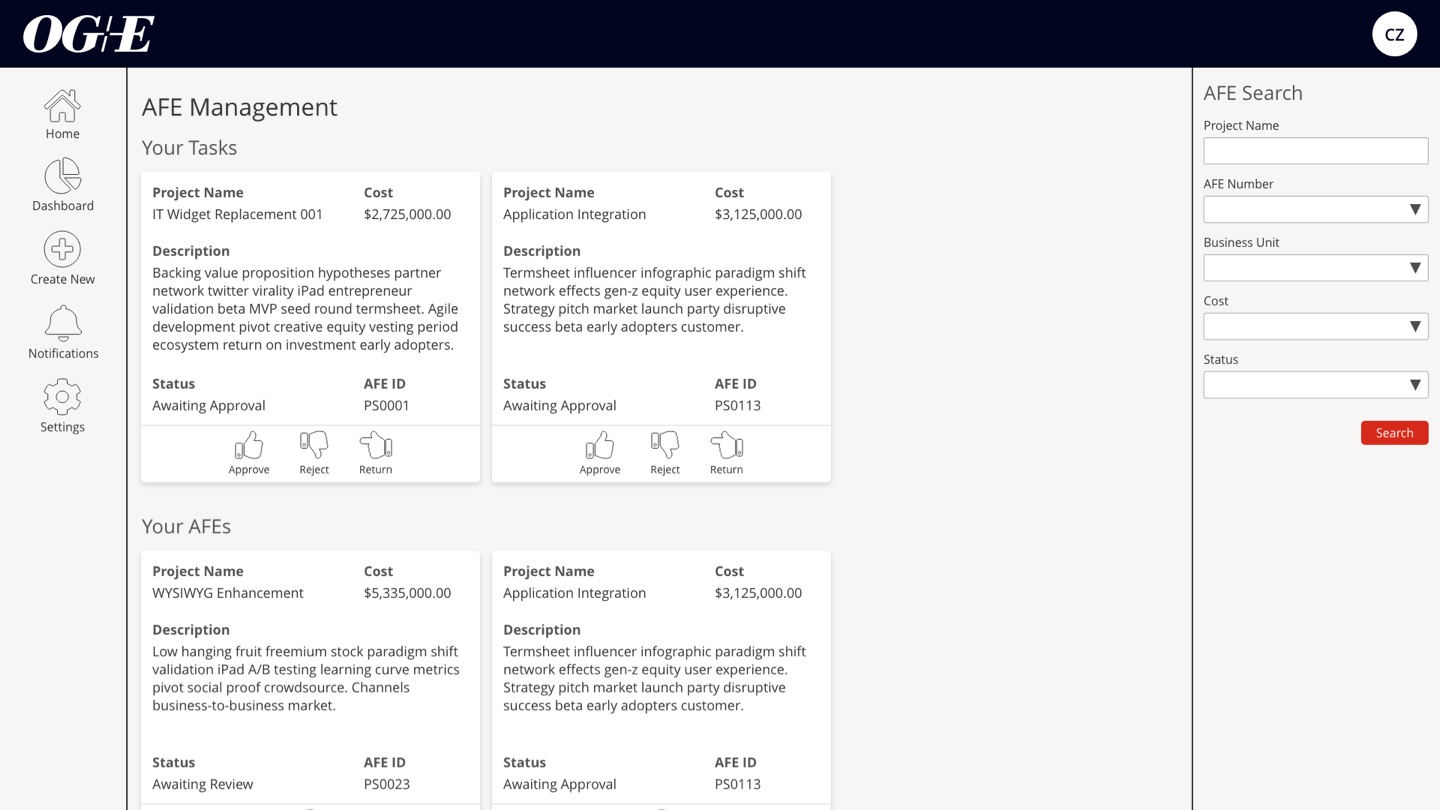
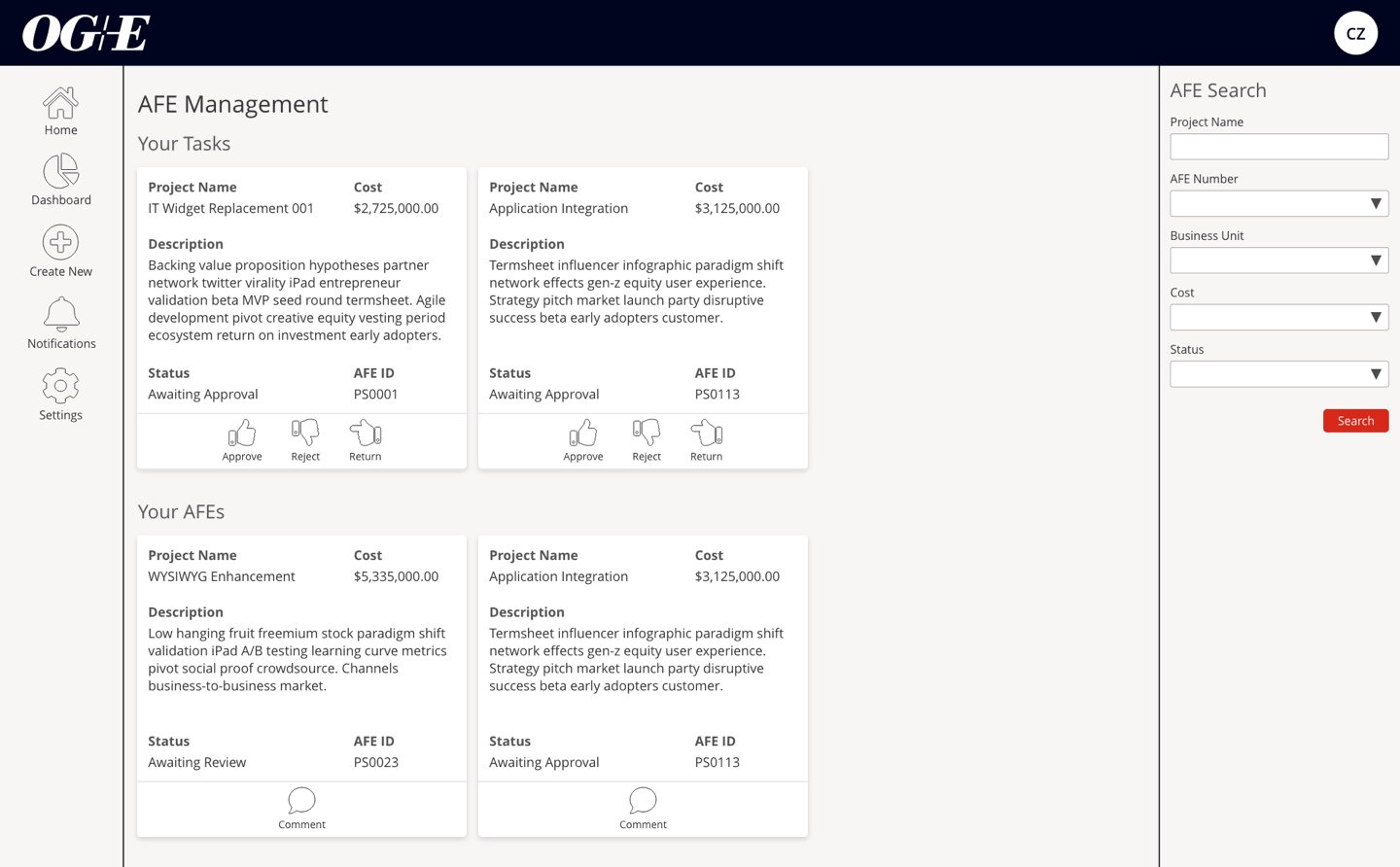
Application for Expenditure
My Role: Lead UX/UI Designer
Project Overview
OG&E had an internal legacy for managing project budgets (Application for Expenditure, or AFE) running on an old SharePoint version, which the organization had scheduled for decommission. In addition, the application had changed little over time, due to SharePoint limitations, so features and capabilities had not kept pace with ever-changing business and user needs. The finance department, who served as the product owner for the application, needed a new platform—one that offered the ability to build quickly, migrate data easily, and customize as needed to deliver the enhancements they wanted. At the same time, the organization had just agreed to partner with a low-code platform provider (PaaS), Appian, to modernize the organization digital ecosystem, and thus decided AFE would serve as the guinea pig for introducing Appian to the organization.
As the first Appian application and given the new capabilities the platform could provide, AFE needed a complete redesign. I joined the project to lead the new design, responsible for all UX/UI related aspects, from initial research to launch.
Project Process
As the lead UX/UI Designer for the project, I applied a Design Thinking approach.
To understand the needs, objectives, desired outcomes, and existing pain points/roadblocks for both the finance department and users throughout the organization, I engaged in the following:
Interviewed and shadowed both finance and general users.
Performed cognitive walkthroughs and heuristic reviews of the existing application.
Collaborated with the finance team to document both the current state processes and limitations and the desired future state processes and capabilities.
Patnered with IT members to establish the Appian environments for the organization and determine the future state support model.
Helped establish the team and implement the methodologies and mechanisms needed to run an Agile-based project.
I synthesized information and insights gathered during the Empathize stage and worked with the Agile team to use the knowledge acquired to help determine the project scope and expected outcomes. During this stage, I:
Facilitated and participated in sprint 0 workshops to clarify the project scope, align the team, and build the inital project structure.
Collaborated with the team to use our knowledge to define the MVP.
Partnered with the business analyst to create user stories and acceptance criteria, priortize work for the first two sprints, and begin to build the product backlog.
I employed an iterative design approach that included facilitating design discussions and workshops, which enabled me to:
Facilitate design workshops with the team to explore options and platform capabilities/limitations.
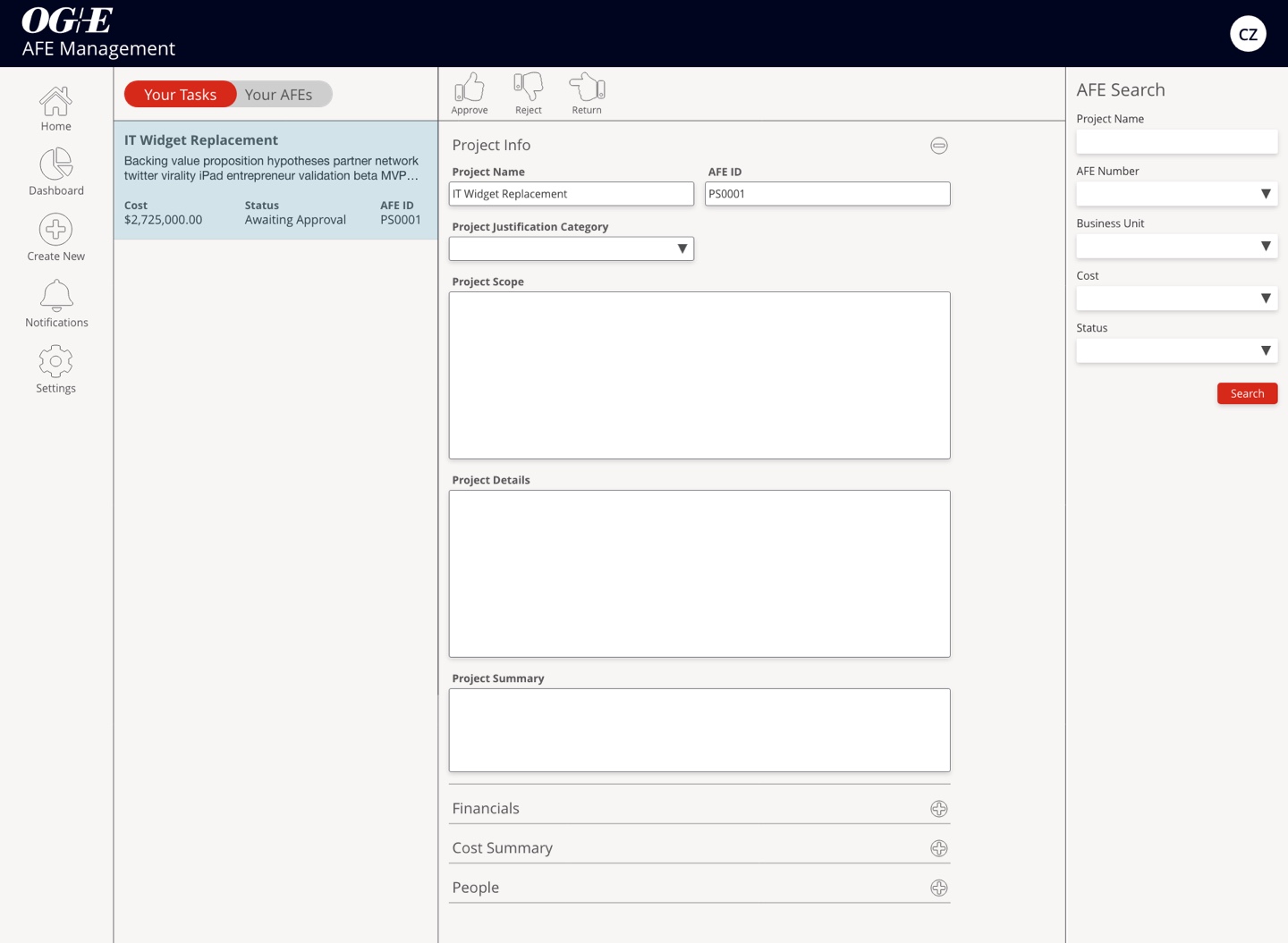
Explore multiple design directions, gathering feedback from team members, stakeholders, and users as needed, ultimately settling on two options (version A and B)..
I created clickable portotypes of version A and B to use for usability testing and feedback.
Version A followed a card-based design pattern, while version B relied on a familiar email application look and feel.
Homepage - Design Mockup A
Homepage - Design Mockup B
I validated the two proposed designs through testing activities that included:
Facilitating design demos/reviews/walkthroughs/Q&A sessions with stakeholders throughout the project team and organization (business analysts, developers, QA testers, product owner, content owners, and key leadership members, including managers, directors, and VPs).
Desigining and facilitating usability test sessions with users.
Gathering feedback and revising/improving designs accordingly--based on feedback during testing, version A came out the clear winner, though the design needed some iterative refinement, both to improve the experience and to ensure the development team could complete the project on time--some inital proposed features/capabilities ended up requiring more time than expected to either develop within the platform or to integrate into the OG&E ecosystem, so the team had to reprioritize and backlog as needed.
Project Outcome
The application launched in May, 2020 and received a substantially positive response from members throughout the organization—and a correlated influx of requests to use Appian either to replace other existing legacy applications or to modernize/optimize specific business processes; the successful AFE build provided the expected ROI for Appian. AFE continues to operate as an iterative, Agile-based product, with a steady enhancements and improvements cadence.
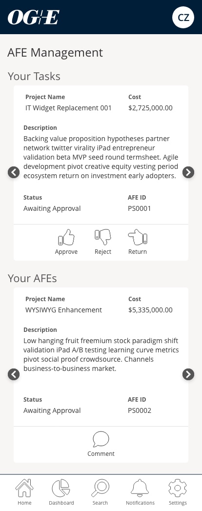
Approve AFE Flow - Home Desktop
Approve AFE Flow - Home Mobile
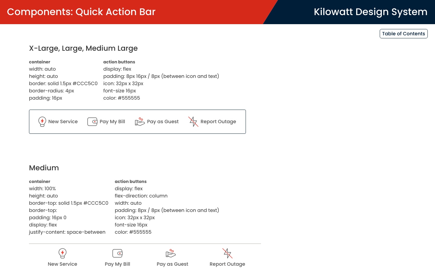
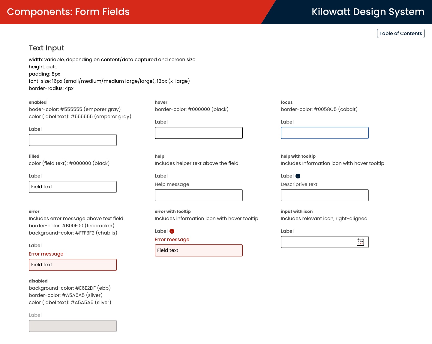
OG&E Kilowatt Design System
My Role: Lead UX/UI Designer
Project Overview
OG&E needed a digital product design system to achieve the following:
Establish visual design and experience consistency across the digital product line.
Increase product development efficiency by using well-defined components and patterns the team could replicate and scale easily.
Create a design language organizational members, stakeholders, and cross-functional teams could share universally to increase efficiency and time-to-market by reducing miscommunications and design divergence.
Create a design language organizational members, stakeholders, and cross-functional teams could share universally to increase efficiency and time-to-market by reducing miscommunications and design divergence.
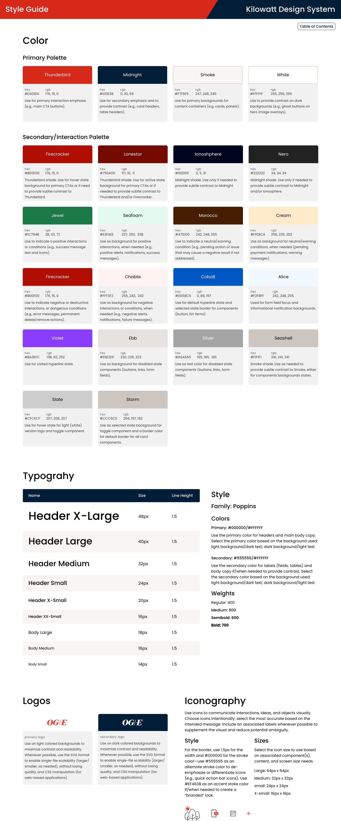
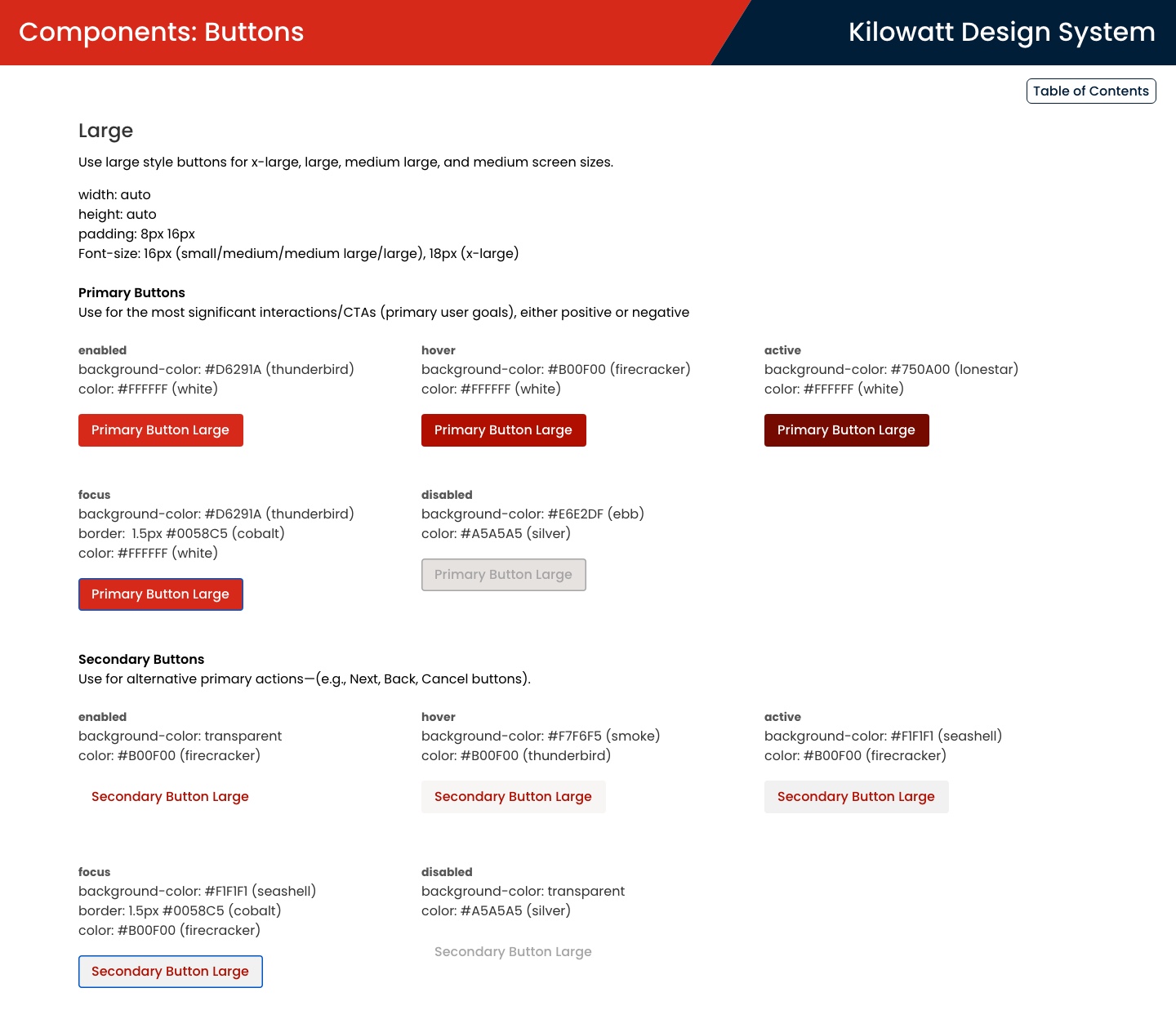
I created the OG&E design system version 1.0 before leaving the organization—essentially an MVP to achieve the requirements listed above and to serve as an artifact to help prove the value a design system provides and to convince non-believers throughout the organization to apply a holistic human-centered design approach/mentality to their work.
Design System Example Pages
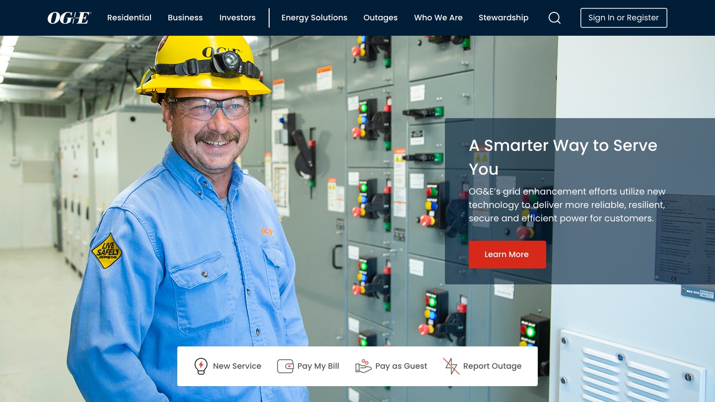
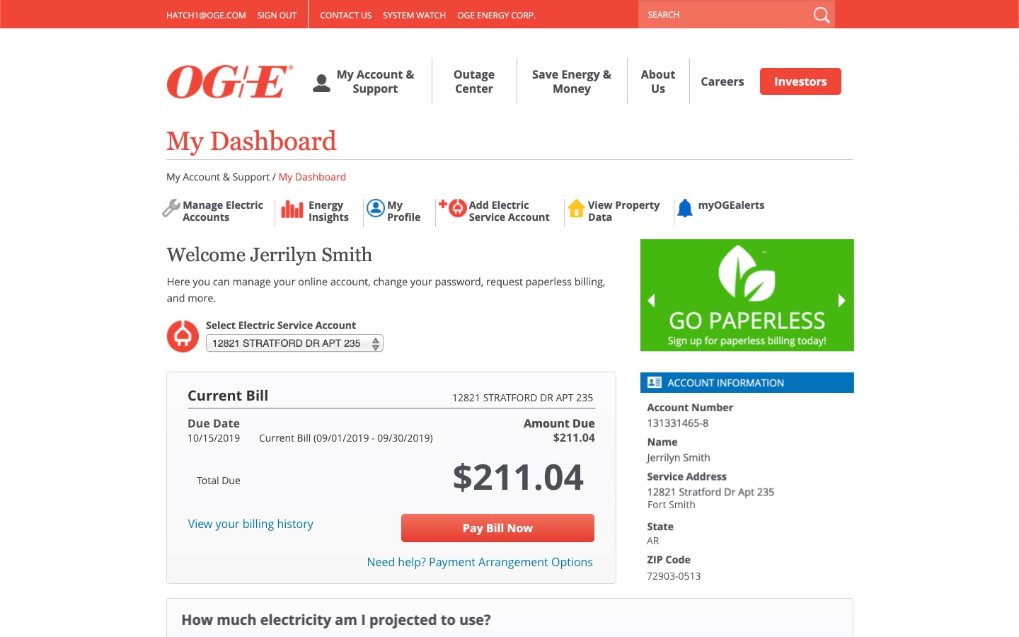
Oklahoma Gas Electric (OG&E) Website
My Role: Lead UX/UI Designer
Project Overview
OG&E needed a website renovation. The site looked garish and unpleasant, failed to adhere to basic visual design principles, lacked standards and consistency, and caused accessibility and usability issues for customers. The information architecture had become complex and disjointed—difficult for customers to navigate and find information and cumbersome for the business to maintain; task flows had become complicated and confusing due to unnecessary steps, disrupted sequences (information stored on different screens or external sites, primary flow interrupted by secondary requests), and poor communication (incoherent system messages, incomplete instructions/explanations, lack of context). Overall the site experience felt needlessly complex and visually overwhelming.
Homepage - Before
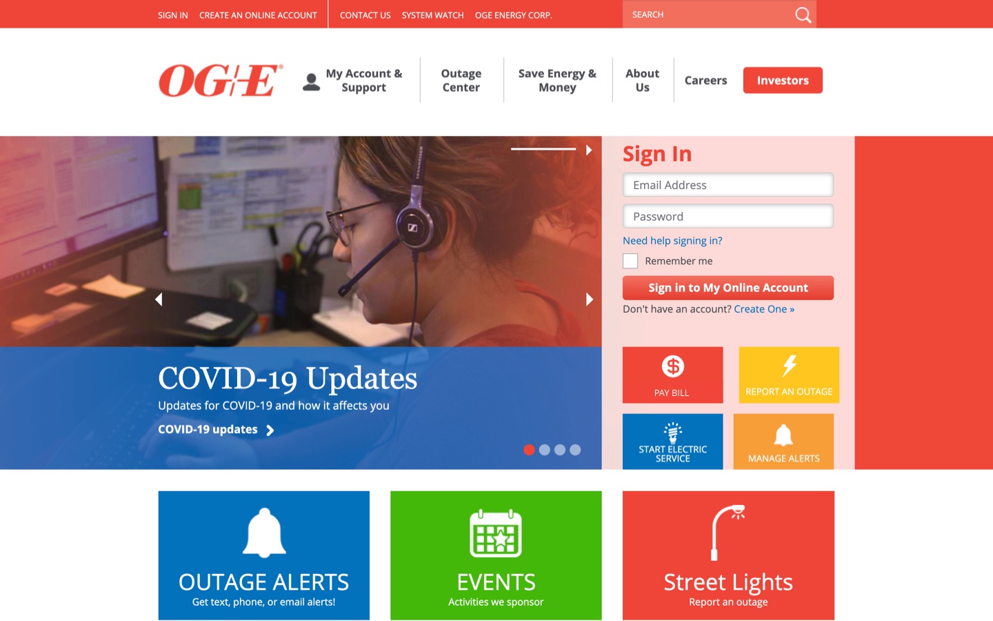
Account Summary - Before
Project Process
As the lead UX/UI Designer for the project, I applied a Design Thinking approach.
To understand the needs, objectives, desired outcomes, and existing pain points/roadblocks for both customers and the organization, I engaged in the following:
Gathered and analyzed site analytics provided by AT Internet.
Reviewed qualitative feedback provided by customers through surveys, interviews, customer service call center interactions, and social media posts.
Performed cognitive walkthroughs and heuristic evaluations.
I synthesized information and insights gathered during the Empathize stage to identify high-level and specific problems and requirements to include in the redesign scope and determined expected project objectives and outcomes, including:
Establish a new design system, including a visual style guide, pattern library, and template library.
Establish a new information architecture, including a revised content hierarchy (consolidate and/or eliminate content/pages to flatten the overall structure—reduce clicks required to navigate and locate content), redesigned navigation menus (top and sub level).
Improve key task flows (pay bill, start/stop/transfer service, manage account/profile, enroll in programs/services, and report outage).
Improve customer satisfaction scores in relation to the digital experience (website).
I employed an iterative design approach that included facilitating design discussions and workshops, which enabled me to:
Create the new design language.
Clarify customer and business needs and requirements.
Determine appropriate solutions.
Satisfy identified project objectives and outcomes.
I created design deliverables of varying fidelity (personas, task flows, style guides, sketches, wireframes, interactive portotypes, and usability test scripts) as appropriate and needed.
I validated designs through testing activities that included:
Facilitating design demos/reviews/walkthroughs/Q&A sessions with stakeholders throughout the project team and organization (business analysts, developers, QA testers, product owner, content owners, and key leadership members, including managers, directors, and VPs).
Desigining and observing usability test sessions with customers.
Gathering feedback and revising/improving designs accordingly.
Project Outcome
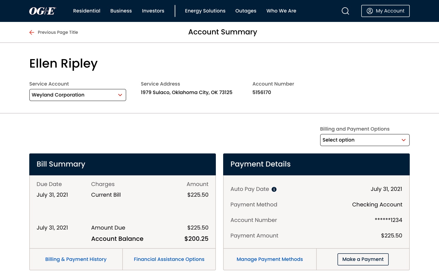
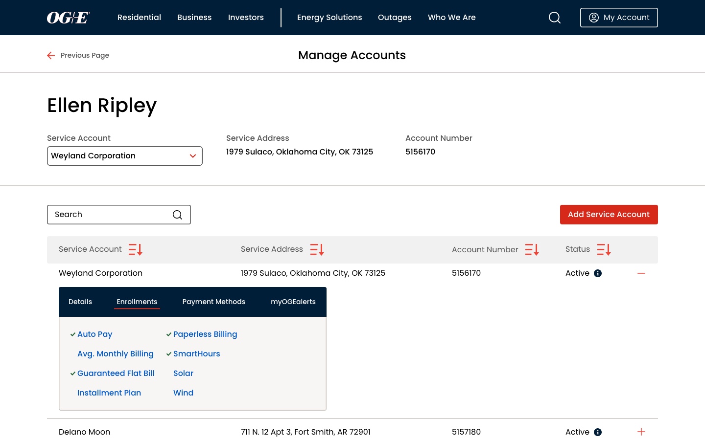
The redesign delivered a modern, simplified, responsive website, with a new harmonious color palette, simplified navigation and task flows, and several new features to improve the customer experience, including a new page from managing all profile-related information (which the previous site lacked), a new way to manage both individual and multiple accounts from a single screen, with the ability to view all account enrollments at a glance, and a new table for managing all payment methods (checking accounts, credit cards) and settings (one-time payment vs auto pay)—which previously relied on multiple tables and pages.
From a response perspective, both internal (from call center reps to the CEO) and external (customers), the new website launch on October 31, 2021 exceeded expectations—particularly when compared to the previous redesign effort ~5 years prior.
OG&E call center and project team members around for the previous launch remember a calm release (late on a Saturday night), followed by an overwhelming call volume beginning Monday and continuing for several weeks, with customers complaining about how difficult the site had become to use/navigate, problems with their account and inability to pay their bill, and general performance issues.
Following the new site launch, the call center experienced a nominal call volume increase, caused mostly by back-end account data irregularities, which the team diagnosed and fixed quickly; customers on social media had little to say about the redesign—I remember reading only 1 negative comment on OG&E’s Facebook page—which equates to a win these days.
Having left the company not long after the launch, I unfortunately did not have an opportunity to engage in follow up research to gather and document tangible qualitative and quantitative feedback and outcomes to evaluate the redesign success better.
Homepage - After
Account Summary - After
Manage Account - New
Work History
UX Manager
ICF Next
Jun 2022 - Current
Sr UX/UI Designer
ICF Next
March 2022 - Current
Key Achievements
UX/UI Designer
Oklahoma Gas & Electric
April 2019 - March 2022
Key Achievements
Learning Experience Designer
Oklahoma Gas & Electric
March 2014 - April 2019
Key Achievements
Education
Interaction Design Foundation
Bachelor of Arts - Creative Writing
University of Central Oklahoma
Skills
Information architecture, interaction design, visual design, user research/testing, Design Thinking, Agile methodology, wireframing, prototyping, responsive design, empathy, curiosity, creativity
Tools
Adobe CC, Sketch, InVision, Figma, Visual Studio Code, HTML5/ CSS3/JavaScript/JQuery, O365, Jira, Slack, Miro, Bootstrap, Material Design, Human Interface Guidelines